
One UI Accessibility
Experience that allows physically constrained users to use Galaxy easily and interact with the outside world
Date
Feb 2017 — Feb 2022
Tool
Sketch, Adobe Creative Suite
Role
Product Design, UX∙UI, User testing (Sub)
Team
UX design, UX Research, UX writing, Product management, Development, QA, Marketing
Relative link
FINAL DESIGN

AD, CONFERENCE
Case study
Target user, Problem, Background, Approach, Solution, Research, Challenge
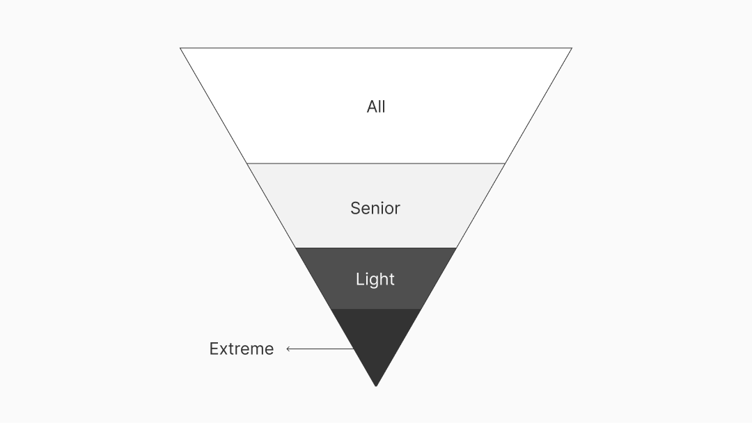
TARGET USER
Disabled people and assistants
Permanent disability
Visual impairment ∙ Blindness, low vision, color impairments, color blindness
Hearing impairment ∙ Deaf, hearing loss
Physical disability ∙ Upper limb impairment
Learning disability ∙ Dyslexia
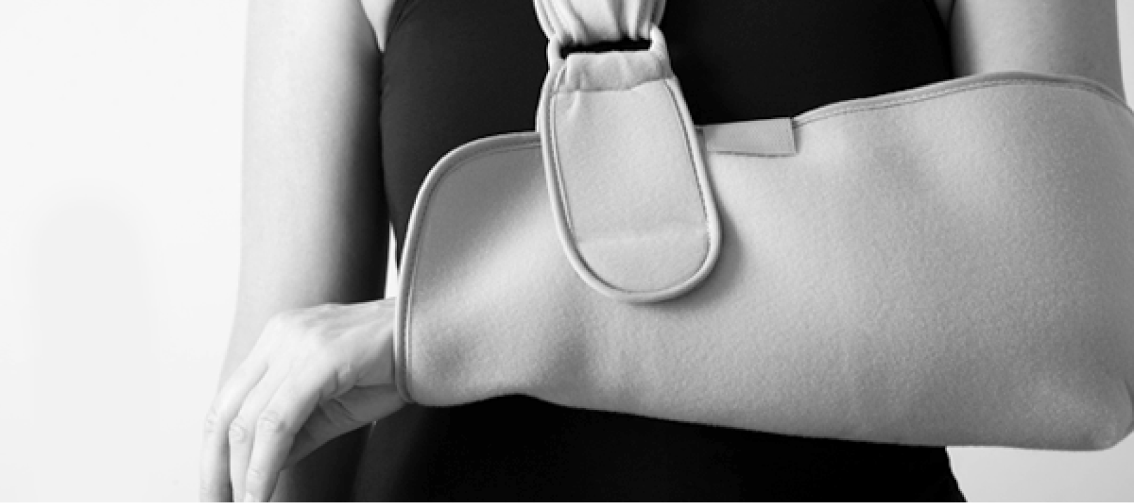
Temporary disability
Temporary physical constraints such as wearing a cast

Situational discomfort
Physical constraints, such as hugging a baby
Assistant
A person who helps users with physical restrictions, such as special education teachers who teach or help users learn accessibility features
PROBLEM
Disabled users unable to access or use their devices

The designer is not an accessibility user.
If you write a UX scenario thinking only of users who have both hands free, can hear sounds, and can see the screen, you cannot design a UX that is easily accessible for everyone.
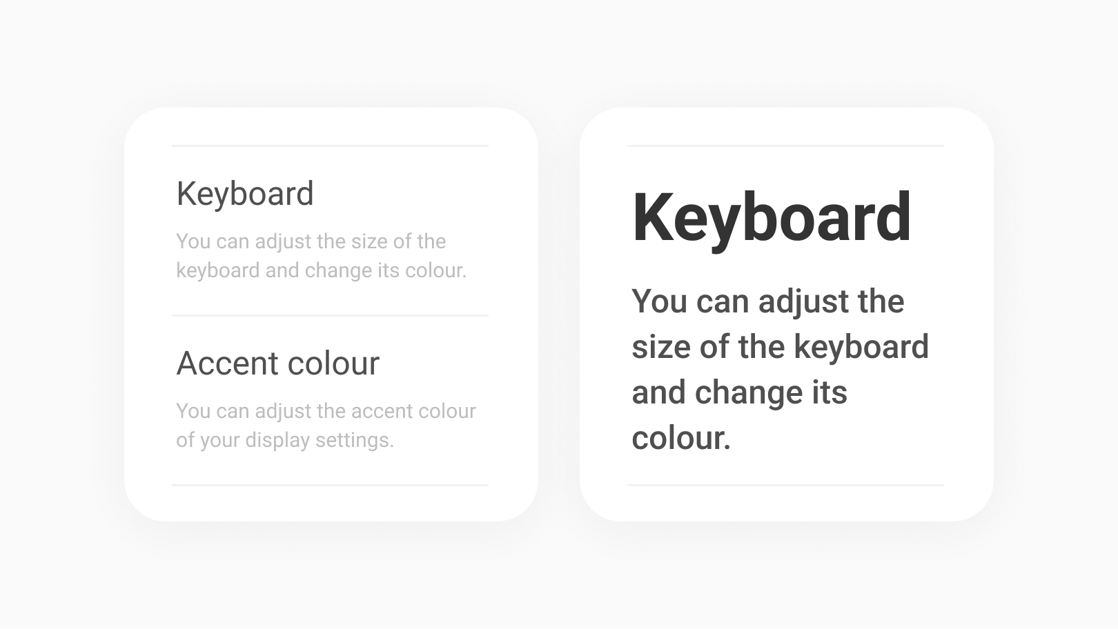
More beautiful, More inconvenient
These are inconvenient designs for accessible users. Small fonts with poor contrast because of their low importance, Flat and concise buttons that don't hurt the layout but have no tactile contrast.
BACKGROUND
The UX scenario of a user who relies only on the sound of reading the screen and the UX scenario of a user who cannot hear the phone ring is clearly different. By analyzing different usage patterns for each type of disability, I considered making it the easiest to interact with the device.
SOLUTION
Make it usable and easy to use
Usable
To provide many features so that any user can independently use the device without assistance, and can enhance accessibility across One UI. To aim to strengthen accessibility features and improve accessibility across One UI.
Easy to use
If you design based on the needs of the mostly impaired users, it becomes a design that is easy for everyone, including light users. It goes beyond adding accessibility features to the completed One UI. One of the keywords in the One UI concept is Accessibility, which means to design with the goal of easy usability from the early stages of design and development to the finished product.
APPROACH
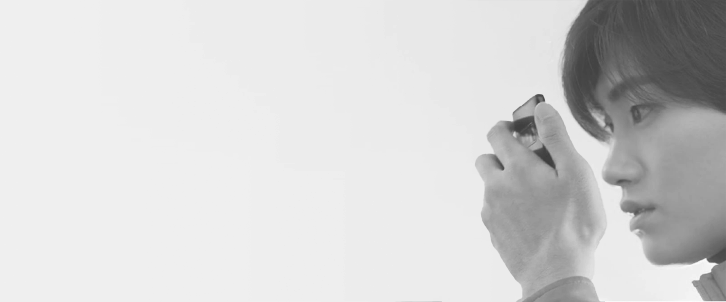
The key to accessibility design is Ethnography. I got into this — How to use Galaxy by type of disability, how to interact with other people or objects with Galaxy, how to interact with groups with the same disability type or between disabled and non-disabled assistants such as special education teachers, sign language interpreters, family.

Ethnography
I visited special institutions to observe usage patterns in order to derive insights by observing user needs, and how each group experienced prototype assistive devices and conducted interviews.
Establish an interview channel
My team created a channel for users and UX designers to communicate quickly and easily by simply giving feedback by e-mail or meeting regularly to drive face-to-face interviews.

Google collaboration
I renewed features including Talkback and Magnification with the Google Android Accessibility team.
RESEARCH
There were large-scale quantitative surveys by UX researchers. Along with this, I drove some small-group qualitative surveys to get feedback from users about the new UX, including accessibility products and others, before and after the One UI version update. I attended accessibility conferences and seminars to keep up with the latest trends. Also, I followed WCAG and strengthened the accessibility standards to apply to One UI.


CHALLENGE

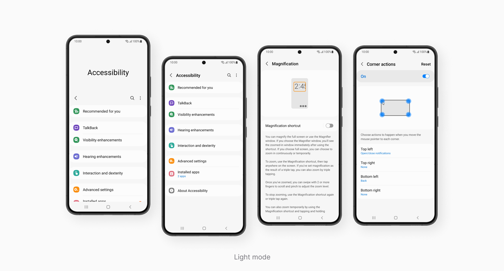
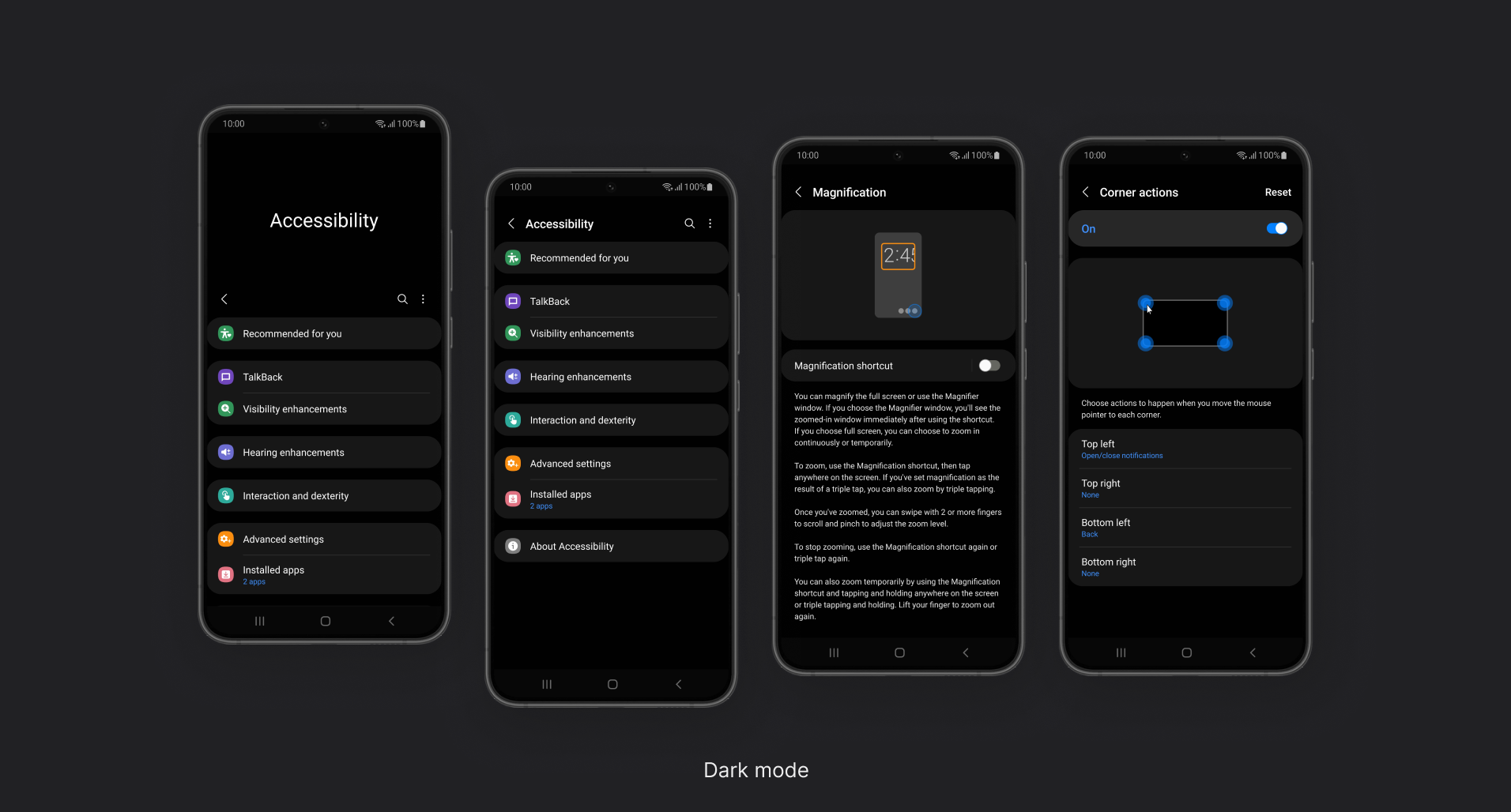
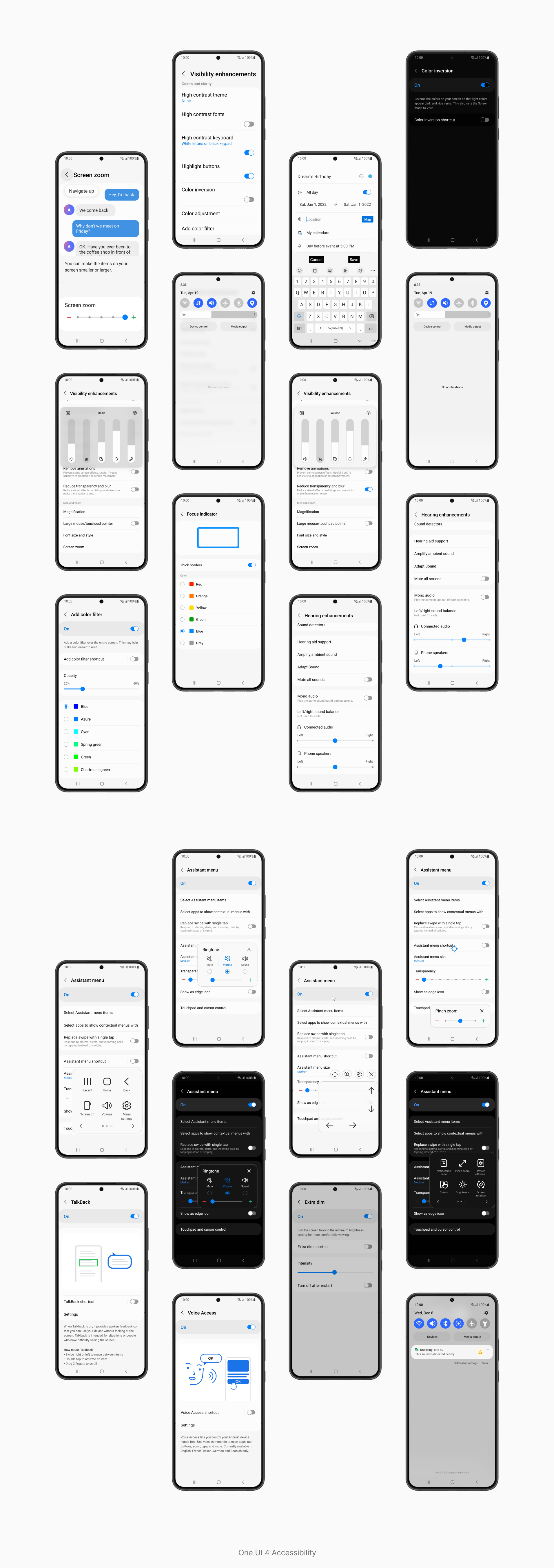
Easy to turn on, Easier to turn off
There are two display modes: Features used mainly by with low vision or senior users can be set at once. The high-contrast mode darkens the screen and makes the text bright and clear. The large display mode enlarges icons and text and adjusts the layout.
You can check or turn off features through the Recommended for you menu at the top of the accessibility settings. It recommends features that are helpful or similar to the one you are using. If a non-disabled user unintentionally changes the text or color of the screen, it can be restored to its original state.

Despite any physically constrained
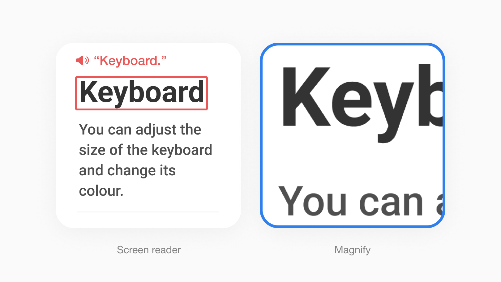
Blind access the device by listening to all information on the screen. The screen should be a well-separated by text with titles, sub-headings, and paragraphs, rather than a single body.
Deaf users find it difficult to read texts quickly or write with correct grammar because sign language is their first language. Text-oriented UI is difficult. Feature names or concise sentences can be enhanced by icons, and descriptions can be enhanced by images.

One UI version up = Accessibility level up
The concept and design system change whenever the software version is updated. Changes that become more beautiful and easier to use sometimes become tasks that users with disabilities have to relearn from the beginning.
In One UI 3, the partial blur style was applied to various screens such as quick panel and volume panel. The feature, Reduce Transparency was added to reflect the feedback of users with low vision, who find it difficult to read small text on a blurred screen.

Increase visibility and reduce design/development costs
The highlight button is a feature for users who have difficulty recognizing the tap target. Just before the OS update, we had to guide to outline the text button and develop it.
I proposed an algorithm that inverts the button text and background color and surrounds the outline of the same color to make it look like a rounded rectangle. I developed this idea from the concept of a text drag box. This algorithm reduces design/development costs. The QA team was able to test features early, making it easier to manage schedules.
Above all, the visibility is higher than the existing light gray outline and the affordance is strong. The layout is not broken when this feature applies to a button in a narrow area.